Muni Riders' Survey
Results
RESCUE Muni
San Francisco, CA
March 19. 1997
Summary
Methodology
Key Findings
Action Required
Conclusion
Note: This report is also available in Microsoft Word
and Adobe Acrobat versions. These contain a Technical Appendix that describes the
statistical issues surrounding a study like this in detail.
Summary
Perhaps the most common complaint about the San Francisco Municipal Railway (Muni)
is that it is unreliable. While it does come very close to covering every area of
the city, according to many riders Muni runs late very often, making it difficult
if not impossible to depend on Muni for anything time-sensitive.
RESCUE Muni, the San Francisco transit riders' association, designed the Muni
Riders' Survey to assess the severity of this problem from the rider's perspective.
For fifteen days in early February (2/1 to 2/15), RESCUE Muni members and other volunteers
recorded how long they waited for the buses or streetcars they used every day. We
then compared these times with the frequencies published on maps and shelters and
confirmed our suspicions: Muni riders continue to experience delays at an unacceptable
rate.
As recorded by Riders' Survey participants, Municipal Railway riders experienced
delays at least 25 percent of the time during the survey. (For 25 percent
of all rides taken, the participant waited longer than the frequency advertised by
Muni.) This means that a commuter who takes Muni to and from work every weekday can
expect to be delayed every other day. (Riders who transfer once a day can
expect to be delayed every day.) While this was the system average, many routes
were far less reliable. Several routes were late more than 40 percent of the time,
and the worst route of all that had a sufficient sample, Route 22-Fillmore, was late
a whopping 55 percent of the time.
Other issues particularly affecting commuters were demonstrated by this survey.
For example, as we expected, the system was less reliable during rush hour than at
other times, running 27% late in the morning and 28% late in the evening.
Expresses, also running 28% late, behaved similarly. (Midday commuters had
better results, with Muni running only 21% late.) This may help to explain the particular
dissatisfaction with Muni among daily commuters in San Francisco. It may also explain
in part why Muni ridership has declined substantially in recent years: according
to Muni's own statistics, ridership has declined by approximately 11 percent in the
last four years.
In Table 1, we have listed overall system performance as well as a selection of
routes. Later in this paper, we provide a complete ranking of routes, and we also
provide performance comparisons based on criteria such as the time of day and the
type of route. Throughout this discussion, we will use letter grades (using the normal
teachers' scale) to describe lines' on-time performance; under this system, Muni's
on-time performance as a whole rates a C. (22-Fillmore, for example, rates
an F.)
Table 1: Summary of Riders' Survey findings
|
route
|
% late
|
grade
|
# responses
|
|
System-wide total
|
25%
|
C
|
1365
|
|
Worst 5 routes:
|
|
|
|
|
22-Fillmore
|
55%
|
F
|
33
|
|
1-California
|
43%
|
F
|
51
|
|
19-Polk
|
42%
|
F
|
45
|
|
F-Market
|
39%
|
D
|
33
|
|
15-Third
|
34%
|
D
|
50
|
|
Best 5 routes:
|
|
|
|
|
5-Fulton
|
16%
|
B
|
44
|
|
54-Felton
|
10%
|
A
|
21
|
|
6-Parnassus
|
9%
|
A
|
45
|
|
KLM-Muni Metro
|
7%
|
A
|
58
|
|
27-Bryant
|
5%
|
A
|
22
|
This Survey does not attempt to determine the root causes of these delays, though
our participants were generous with their comments and suggestions for improvement.
After describing the findings in detail, we will discuss some possible reasons for
delay brought up by our participants, but we believe that it is fundamentally Muni's
responsibility to find and solve problems that impact on-time performance. In particular,
Muni should be able to provide consistent performance across all lines.
Methodology
We conducted the Muni Riders' Survey for fifteen days, from February 1 to February
15. Participants, mostly but not all members and supporters of RESCUE Muni, recorded
for each bus or streetcar they took, the following information:
- route
- location
- date
- time they arrived at the stop
- time the vehicle arrived
Some participants also recorded the vehicle number, which we are not using for
this study but which may prove useful in the future.
After data were submitted by mail or our World Wide Web site, we entered this
information into our database using Microsoft Excel. For each data point, we calculated
waiting time and compared it with the frequency advertised on Muni shelters and in
the Official San Francisco Street & Transit Map, 1996 edition. If waiting
time exceeded the advertised frequency, that vehicle was late from the rider's perspective,
even if it met some internal Muni schedule. We used this Boolean variable to calculate
the percentage late for each route and for other criteria such as time of day and
type of vehicle.
This is an admittedly generous standard, because riders can generally be expected
to arrive at the bus stop at random intervals. (Riders who arrive after others have
waited for some time may wait less than the advertised frequency and therefore not
report a late bus as late.) We chose this standard because it was a simple one to
administer and because it reports the minimum number of buses and streetcars
that are late. Our hypothesis, which seems to have been proven by the data, was that
Muni is so unreliable that it will still show a poor on-time performance record despite
the generous standard.
For each ride taken, we also measured waiting time and a "normalized waiting
time," waiting time expressed as a percentage of the published frequency. These
are also included in the analysis of specific lines and of the system as a whole.
(Please see the Technical Appendix, in the Acrobat or Word version of this report, for a detailed description of
these metrics.)
In total, 97 people participated in the survey, generating 1365
data points. The most widely reported line was the N-Judah streetcar, with 120
responses, followed by the L Taraval line with 59 and the KLM underground
Muni Metro line with 58; we will use these particularly well-ridden lines,
as well as some others, as the basis for more detailed analysis of performance below.
Note: The data in this survey are quite comparable to previous studies
conducted by Muni and RESCUE. The major difference is that this study is done from
the rider's perspective: in our opinion, it is much more important to understand
how riders are affected by Muni failures than it is to assess Muni's performance
against internal benchmarks. RESCUE Muni conducted a brief study of several lines
in November 1996 in which observers tracked the arrival times of six routes for one
hour each. In that survey, 46 percent of vehicles were found to be late in comparison
to the published schedule; when we imported these data into our database, we found
that the typical rider would at that time have been delayed 18 percent of the time.
Our conclusion from this comparison is that Muni has not improved at all since last
fall; in fact, it may have worsened a bit.
Key Findings
Overall system performance
Survey participants set out to test the hypothesis that Muni is unreliable. What
we found was a Municipal Railway that consistently misses schedules and very frequently
keeps riders waiting far longer than they should expect to wait. For the express
commuter to the Financial District, this is bad enough; San Francisco is a place
where one schedules 8 am meetings at one's peril because attendees may not make it
on time. But for the rider who does not own a car and who must make several trips
a day using multiple lines, perhaps to multiple jobs and errands across the city,
this is a much more significant burden.
Overall, as stated above, the system ran late 25 percent of the time. Of
the 1365 rides reported, 339 had waiting times longer than the frequency
advertised in the system map. Depending on the
line and time of day in question, this translated to waiting times of as little as
ten minutes (for supposedly frequent lines like 1-California and 14-Mission) but
as long as an hour for some less frequent lines. Long wait times were not isolated
incidents; as the following chart shows, while the majority of riders in fact waited
only a few minutes, 25 percent waited more than 11 minutes, and one rider in twenty
waited more than 24 minutes. (The thick line in the chart is for all of Muni; above
it is a line representing the relatively reliable KLM Muni Metro, and below it is
a line representing the unreliable 22-Fillmore.)
Chart 1: Distribution of waiting time for MUNI and two
selected lines
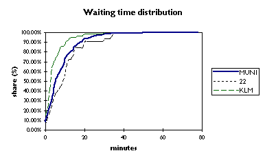
Put another way, 25 percent of riders waited longer than 100% of the advertised waiting
time, but many of those riders waited much longer than that. We also analyzed the
distribution of what we will call "normalized wait time", or waiting time
as a percentage of advertised frequency. Seven percent of riders waited more than
twice the advertised amount, and some waited as long as six times the advertised
frequency. On average, our participants waited 82 percent of the advertised
frequency. (A system running well would have this figure in the 50 to 60 percent
range; see the Technical Appendix for a detailed discussion of this.)
Those who ride Muni every day are familiar with the crap-shoot nature of the system
that these figures demonstrate. When they arrive at the bus or streetcar stop, while
riders have a reasonable confidence that are likely to be on time, they have
no idea if this particular time is their turn to be 45 minutes late, thanks
to Muni. This makes it impossible to depend on the system for consistent service
and pushes many riders into using automobiles or taxis (at much greater expense)
just to avoid possible delays. To be able to rely on Muni, customers need to allow
75 to 90 minutes to cross a city that is only eight by eight miles.
Problem lines (and better lines)
On-time performance and related metrics differed markedly from line to line. While
the system as a whole rated a C for its performance based on the standard teacher's
grading scale, we found five lines that rated a D and three lines that rated an F.
(This excludes lines for which we received fewer than twenty responses.) Lines graded
F were 22-Fillmore, 19-Polk, and 1-California, and lines graded D were
15-Third, N-Judah, 44-O'Shaughnessy, F-Market, and 30-Stockton. The
percentage late for each line is shown below. Also notable is the average normalized
waiting time for these lines; riders on all three lines graded F wait on average
substantially more than the advertised frequency, and no route graded D or F had
riders waiting on average less than 80 percent of the scheduled time.
In sharp comparison, certain lines ran quite well from the rider's perspective.
Four lines with sufficient data received a grade of A: 6-Parnassus (including
some other Haight Street buses), 54-Felton, 27-Bryant, and the underground
portion of the KLM Muni Metro. These routes were on time more than 90 percent
of the time, and this was demonstrated also in normalized waiting time; the typical
rider can expect to wait between 40 and 60 percent of the scheduled frequency on
average, which proves to be about right for a line running well. The one line graded
B, 5-Fulton, also had the typical rider waiting a reasonable amount of time.
Table 2: Ranking by line of on-time performance and normalized
wait time
(Excluding lines with fewer than 20 responses)
|
route
|
% late
|
grade
|
avg waiting time (min)
|
avg normalized wait time
|
StdDev of waiting time (min)
|
total responses
|
|
22
|
55%
|
F
|
10
|
116%
|
9
|
33
|
|
1
|
43%
|
F
|
8
|
130%
|
7
|
51
|
|
19
|
42%
|
F
|
11
|
119%
|
9
|
45
|
|
F
|
39%
|
D
|
9
|
102%
|
11
|
33
|
|
15
|
34%
|
D
|
8
|
93%
|
5
|
50
|
|
N
|
33%
|
D
|
6
|
84%
|
5
|
120
|
|
30
|
31%
|
D
|
4
|
97%
|
3
|
46
|
|
44
|
31%
|
D
|
12
|
92%
|
15
|
26
|
|
M
|
30%
|
C
|
8
|
76%
|
6
|
37
|
|
1AX
|
30%
|
C
|
10
|
98%
|
8
|
27
|
|
38
|
27%
|
C
|
4
|
65%
|
4
|
22
|
|
K
|
27%
|
C
|
8
|
79%
|
7
|
52
|
|
71
|
25%
|
C
|
10
|
77%
|
10
|
20
|
|
24
|
23%
|
C
|
7
|
70%
|
5
|
52
|
|
43
|
22%
|
C
|
9
|
75%
|
7
|
43
|
|
21
|
22%
|
C
|
6
|
71%
|
4
|
27
|
|
L
|
22%
|
C
|
7
|
85%
|
6
|
59
|
|
J
|
22%
|
C
|
10
|
88%
|
8
|
49
|
|
5
|
16%
|
B
|
5
|
75%
|
4
|
44
|
|
54
|
10%
|
A
|
12
|
60%
|
6
|
21
|
|
6
|
9%
|
A
|
7
|
54%
|
6
|
45
|
|
KLM
|
7%
|
A
|
4
|
41%
|
5
|
58
|
|
27
|
5%
|
A
|
7
|
47%
|
4
|
22
|
|
Grand Total
|
25%
|
C
|
8
|
82%
|
8
|
1365
|
Chart 2: Comparison of lines by on-time performance
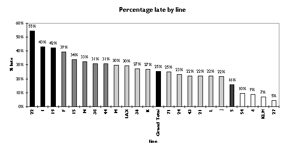
Examples of lines
To illustrate how routes differ, we have identified examples of particularly poor
performers (graded F), typical performers (graded D and C), and good performers (graded
A).
22-Fillmore (Graded F): This line had the worst on-time
performance among those with twenty or more responses. Not only was its on-time performance
dismal (55 percent late); in addition, it had an average normalized wait
time of 116 percent. This means that the typical rider, arriving at random
throughout the advertised frequency (typically 8 to 15 minutes) waited 16 percent
more than he should expect to wait having just missed the previous bus.
In addition, as the following chart shows, the 22-Fillmore rider has a 14 percent
chance of waiting twice the frequency and a 5 percent chance of waiting three
times the frequency. This translates into real wasted time; 25 percent of 22-Fillmore
riders waited 14 minutes or more on this supposedly frequent route. Needless
to say, this is a sign of a consistently unreliable bus line.
1-California (Graded F): This line also had very poor on-time
performance despite (or perhaps because of) its extremely high advertised frequency.
This was the line with the highest average normalized waiting time, 130%,
with 43% of buses running late. This problem was particularly noticeable during
rush hour: 55% of riders waited longer than they should, waiting 170%
of the advertised frequency on average.
As with 22-Fillmore, a substantial fraction of 1-California riders waited much
more than the advertised frequency. 14% of 1-California riders waited more
than twice the advertised frequency, and one unfortunate rider waited almost seven
times the advertised frequency, the longest relative wait recorded. Again, this
was real wasted time: 10% of riders of this very frequent line waited 17 minutes
or more, and one rider in twenty waited more than 23 minutes. (See Chart 1 above
for an illustration of this in comparison to Muni as a whole.)
N-Judah (Graded D): This was the most widely reported line
in the survey, with 120 responses. This line was a good example of the mediocre service
common throughout Muni: it ran late 33 percent of the time, but riders did
not on average wait more than the advertised frequency. (Average normalized waiting
time was 84 percent, very close to the number for all of Muni.) Like 1-California,
however, N-Judah was less reliable during rush hour, with 41 percent of rush
hour streetcars late and average waits of 112 percent of advertised times.
Distribution of N-Judah waiting times was not as skewed as Lines 1 and 22, but
it still left a bit to be desired. Only six percent of N riders waited longer than
twice the advertised time, but these six percent found themselves waiting 19 minutes
or more, and we did have one rider wait more than four times the posted interval.
The latest twenty-five percent of N riders waited 120% of the advertised interval,
which translated to ten minutes or more. This is in our opinion a significant if
not egregious amount of wasted time.
24-Divisadero (Graded C): This was another example of
a mediocre line; it performed slightly better than the Muni average, with 22%
of riders reporting late runs, and with a mean normalized wait time of 70%.
Like others, this line was later during rush hour than at other times (32% late),
but it did not exhibit the long delays that lines discussed above had. Morning rush
(35% late) was a particular problem here.
Distribution of 24 wait times was much better than on other lines. While 22 percent
of riders waited longer than published frequency, no rider waited more than twice
that interval. While 27 percent of riders waited more than 10 minutes, only 8 percent
waited more than 15 minutes; because intervals are longer on 24 than on some other
lines, this is not unreasonable. Perhaps this is due to better dispatching or scheduling
than on some other lines; another thought is that the corridor traveled by the 24
has much less traffic than streets like Fillmore and Sacramento.
KLM-Muni Metro, between Embarcadero and West Portal (Graded
A): Perhaps due to the controlled environment, the KLM Muni Metro (from Embarcadero
to West Portal only) performed remarkably well. Only 7 percent of underground
KLM trains were late, and this led to an average wait of 41% of the posted
interval, the lowest among lines with sufficient data. Only 3% of KLM trains
were late during rush hour, an excellent performance. Evenings were a problem, however;
perhaps because the substitute service is not as reliable as the streetcars, evening
KLMs were late 25% of the time.
With such a good on-time rating, one would expect a relatively good distribution
of waiting times, and in fact that was the case. Only 10% of KLM riders waited more
than 10 minutes, and while the longest normalized wait was 2.5 times the published
interval, only three percent of KLM riders waited more than 1.5 times the advertised
frequency. (Compare this with the 22, where 21% of riders waited more than 150% advertised
frequency.) This does not include delays after the rider has boarded, however:
many users commented that they experienced long delays waiting to arrive at Market
Street stations in the morning rush hour. (See Chart 1 above for an illustration
of this in comparison to Muni as a whole.)
6-Parnassus (Graded A): This line also did very well. Only
9 percent of 6-Parnassus vehicles (together with 7 and 66 buses reported as
"Haight Street corridor") were late, and 6 riders waited 54 percent
published frequency on average. The only time that 6 had some difficulty was
on weekends, when 17 percent of buses were late, but even then the expected wait
was only 62 percent of the published interval. (Rush hours were not significantly
different from the total, 11% late.)
Distribution of 6 wait times was also not bad: nobody waited more than 2 times
the advertised frequency, and 96% waited 1.2 x advertised or less. This translated
to wait times of 16 minutes or less for 96 percent of riders. (One rider did wait
40 minutes, however.) Like the KLM, the 6 seems to be run reasonably well.
These data beg the question: why are there such differences among similar lines?
Like 22-Fillmore and 1-California, 6-Parnassus runs down heavily traveled streets
with slow traffic and much double-parking - yet it runs on time, even at rush hour,
while 1 and 22 run very poorly. The KLM has a certain advantage since it runs in
a tunnel, but even with the frequent breakdowns in the tunnels it seems to do better
than most surface routes, particularly the other streetcars, which all scored C or
D.
Performance by type of line and time of day
We also measured performance of different types of lines and different times of
day in the aggregate in this survey. Rush hour vehicles were on average a bit later
than vehicles at other times of the day (27% late rush hour vs. 23% late nonrush),
and riders waited a bit more relative to the timetable (87% vs 77% normalized wait
time), but these differences were not huge. Expresses mimicked the rush hour behavior,
with 28% late and average waits at 92% of scheduled intervals, worse than the general
population but not by a wide margin. Weekends and evenings in the aggregate were
not much different from the total sample, but we did find that the buses run much
better on Sundays (22% late) than on Saturdays (35% late).
There were also slight differences between electric and diesel coaches: older
electrics ran 26 percent late and new electrics (on Routes 14 and 31) ran 30 percent
late, while the diesel coaches ran 23% late on average. However, these differences
were not nearly as significant as the differences between specific lines.
User comments
With the survey forms that were returned, we also received many comments on the
quality of Muni service during the survey period and in general. Many riders reported
trouble with the lines they were surveying:
- Bus nearly ran into a car!
- I take Muni everywhere throughout the city for my work and I want to share
with you that the Fillmore #22 line is usually and consistently not on any schedule.
Need to wait forever. Sometimes I've waited 30 minutes or more for a #22, then 2
or 3 come... At times I've waited more than 40 minutes for the #37.
- Most Operators did NOT announce intersecting lines or major streets
- On 2/11 on my ride on the 22-Fillmore, the driver stopped the bus at Fillmore/O'Farrell
so he could go buy some candy. I didn't get his id # because he wasn't wearing his
coat.
- This survey does not capture the many times we give up. [Many comments said
"gave up and walked."]
- [Line 1:] Lots of people waiting; 4 buses came at once!
- [Line 1:] two packed buses (7:42, 7:50); woman in next seat said she'd had
to wait an hour!
- [Line 21:] terrible driver #3842; abrupt stops ñ passengers bracing to
keep from falling forward
- [Line 22:] At least 90% of the time when I take the bus anywhere it is in
conformity with the listed schedule. That however does not excuse the few times when
the bus was grossly late. This lateness however can be attributed to many factors,
the principal one I believe is the interference of traffic and stop lights on the
bus route.
- [Line F:] full to capacity - 30 people left behind
- [Line M:] waited 25 min for M or 28, didn't come. M cancelled - no signs,
no info. Approx 60 people as confused as me. Then a shuttle bus whistled past - no
info!
Some people noted an improvement in service, just during the survey period:
- I am somewhat dismayed at how little I have waited during the survey period.
Is there any reason to believe that Muni has beefed up service during this time (only
to slip again after this week)?
- I am STUNNED at the improvement in service!!
- These were the best two weeks I have had on Muni in months. On Sunday 2/16
when the survey was over, it took 1.25 hours to get a 27 to Market in the morning.
Then gave up waiting for a 21 and took an N car.
- [Line N:] It seems that during the two survey weeks, MUNI was on its best
behavior... Waiting, however, did not seem to be the most aggravating part of my
commute. Overcrowding, frequent back-ups in the Market Street tunnel, and dysfunctional
elevators were the most frustrating... Since February 15 ... my wait times have become
noticeably longer, and in many cases they've doubled. Overall MUNI is unreliable
and inefficient ... No wonder there are too many cars in the city.
These comments seem to confirm our assessment that Muni is consistently unreliable.
Also, they serve as an important reminder of what can happen when Muni is held accountable;
while we are skeptical that this survey was a cause of improvements in service, in
general a closely watched system is a system that is "on its best behavior,"
as one rider commented. In the absence of viable competition, good supervision and
third-party measuring may make a substantial difference.
Probable causes
This survey shows that Muni customers experience very poor service on some routes,
but not on others. We believe that this clearly demonstrates that Muni has the ability
to serve the city well; at the present time, it is not doing this effectively throughout
the city. The following are some structural issues that we believe have an impact:
- Budget: Muni may simply not have the funding needed to provide as many
runs as are shown in the schedule. In the past ten years, Muni's budget has been
cut by a cumulative total of $30 million in real terms, and this may render it impossible
to deliver service at the scheduled level of intervals on every line.
- Traffic: Several routes that we found performed particularly poorly (1,
22) are in high-traffic corridors not well-suited to mass transit. In addition, the
Embarcadero and Central Freeways are down and this has significantly added to the
congestion on the streets of San Francisco in the downtown corridor. Muni routes
have not been re-timed to reflect the new traffic realities in many years. This creates
tremendous pressure on the operators to meet their schedules given likely delays
with loading passengers, frequent double parking, and so on.
- Absenteeism: The added stress on operators from not having sufficient
recovery time from traffic delays, delays loading passengers, and having to carry
a double load because of understaffing may result in further staff shortages due
to absenteeism.
- Supervision: The 40% reduction in the number of street supervisors over
the past decade has exacerbated the problem because without street supervisors, the
system cannot be managed dynamically when problems occur. Also, of course, with effective
street supervision operators can be held accountable for meeting schedules. A partial
restoration of these positions has been promised but not yet seen.
- Equipment failure: Many riders reported long delays due to power failures,
broken-down streetcars and buses, and similar issues. To Muni's credit, a capital
program now in place to replace all Muni Metro streetcars seems to be making a positive
difference.
Action required
Given the above, RESCUE Muni calls for the following from Muni and the city.
- Scheduling: Muni must stick to its schedules. If the schedules are unrealistic,
and this survey suggests that they may be (particularly on very-frequent routes like
1-California), Muni should re-time major routes and publish a schedule it can meet.
Together with this must be a much more serious effort by Muni to hold operators,
supervisors, and managers responsible for the reliability of their lines; public
disclosure of all internal performance statistics (discussed below) is a great way
to achieve this.
- Traffic: This is clearly a major issue, particularly with widely-traveled
routes such as 1 and 22. Muni needs to continue to work with SF Parking and Traffic
to ensure priority enforcement against double-parking on congested downtown corridor
streets, and it needs to push for more transit-only lanes on downtown streets. (The
Market Street diamond lane seems to have made a positive difference.) Another useful
step might be traffic-signal pre-emption, so that Muni vehicles can make the lights
at intersections along congested roads.
- Budget: While RESCUE Muni is hesitant to call for a wholesale increase
in taxpayer or farepayer funding for Muni at this stage, particular elements in the
Muni budget may require some additional dollars. In particular, Muni should find
a way to increase the number of street supervisors on patrol each day; a monitored
system is in general a more reliable and accountable one.
- Communications: This is one of Muni's biggest weaknesses today. When problems
occur, riders are rarely told about them in a way that is useful for trip planning.
Similarly, the public does not have access to Muni's internal reliability statistics.
Muni needs to rectify this immediately; it must regularly publish data in detail
on reliability, complaints, unexcused and excused operator and manager absences,
and budget status. This would hold Muni accountable in a way that it is not today,
and it would provide a means for the public to judge whether Muni's management is
up to the task. In London, the Underground regularly publishes a "Customer Charter"
that provides these details to the riding public; this would be an excellent model
to follow.
Conclusion
The Muni Riders' Survey, conducted in February 1996 by RESCUE Muni, demonstrates
the poor reliability of the San Francisco Municipal Railway and the wide variations
in service quality from line to line. While Muni itself rated a C, with 25%
of riders experiencing delays, several lines (rated F) had more than 40% of
riders delayed during our survey. This is a major cause of customer frustration,
as described in detail by many of our 97 participants.
We believe that this unreliability of Muni and of particular lines is a major
reason for the decline in ridership in recent years, and we join the call for serious
reforms in the way that Muni does business. In particular, we will insist on the
real accountability that is expected for an organization supported by our fares and
tax dollars but that is glaringly absent with Muni. This will help provide Muni the
incentive it needs to become a world-class transit system again. San Franciscans
may love to hate Muni, but we absolutely deserve better.